Wine label designs with Seckford Agencies
We’ve worked with fine wine brand Seckford Agencies on a number of label design projects. Here are a few of our favourites…
Los Picos
The idea
Los Picos translates as “The Peaks” – taking its name from the three Andean mountain peaks which can be seen on the horizon from the winery. A closeup shot of an elegant corkscrew pleasingly reveals three peaks in the negative space.


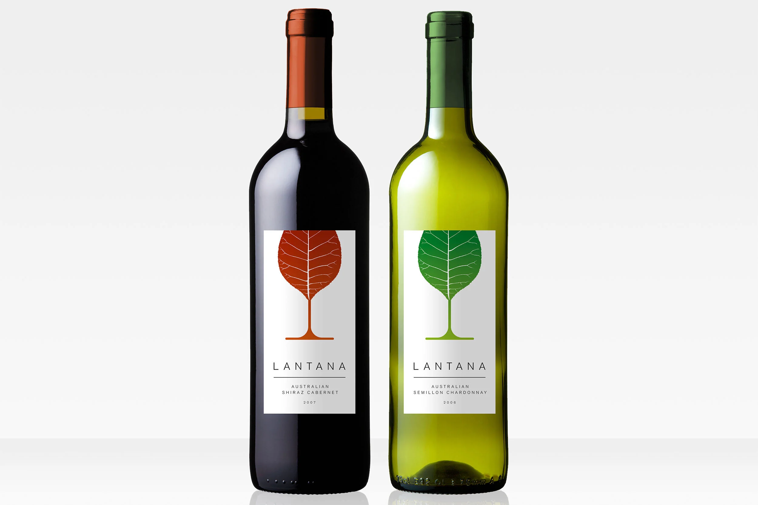
Lantana
The idea
The Lantana leaf elegantly transforms into a wine glass. The white background enables high shelf stand out, as well as feeling bold and contemporary.

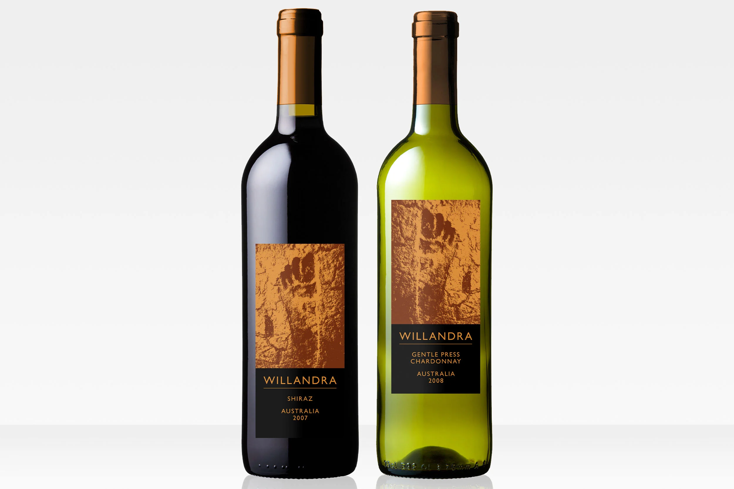
Willandra
The idea
The Pleistocene footprint in the dried up mud in the Willandra region, from which the wine takes its name, is an iconic image, telling the very long and distinctive story of the area. The labels were printed black on metallic bronze for a more premium feel, and were positioned to reference the ancient footprints.

The Stone Gatherer
The idea
‘The Stone Gatherer’ brand name references the story of two brothers, Anthony and Pat, clearing their parents’ land of stones so that it could be cultivated to become vineyards. Using a pile of these removed stones, an image of grapes is unexpectedly created.


“We have worked with Paul on a variety of wine label designs, and have always been impressed with the breadth of new image ideas that he manages to suggest to us. We have had very constructive email and phone conversations to amend the chosen design option, and very often ask him for much more than we intended to, but Paul has always delivered cheerfully and the many labels have been designed to meet our budget on time and in the correct formats for printers to work with. We highly recommend him.”
– Julie Maitland, Seckford Agencies