Branding and design with The Partners
Working with top London branding agency The Partners for four years with some of the brightest minds in the industry was a dream come true. Here are a few highlights from that time.
Mr Singh’s Bangras
Project background
A combination of two of Britain’s greatest loves, sausages and Indian food, Mr Singh’s Bangras are quite unlike any other sausages.
The challenge was to convey the authentic Indian ingredients and make Mr Singh’s Bangras stand out from all the other gourmet sausages on the market.
The idea
The world’s first branded sausage. By applying a henna pattern to the skin of the sausage, the product itself becomes the packaging, clearly showing that these are no ordinary sausages.
Packaging
The card sleeve acts as a protective cover for the sausages, whilst showing the product as prominently as possible.
Outcome
Mr Singh's Bangras was awarded Packaging Winner at The Design Week Awards, as well as winning awards from The Die-Line Awards, Cannes Design Lions, New York Festivals, Clio Awards and Benchmarks.
The National Gallery Grand Tour visual identity
Project background
How do you promote the National Gallery’s permanent collection, drive positive reaction for sponsor Hewlett Packard, and create a summer talking point for a modern, culturally aware audience?
The idea
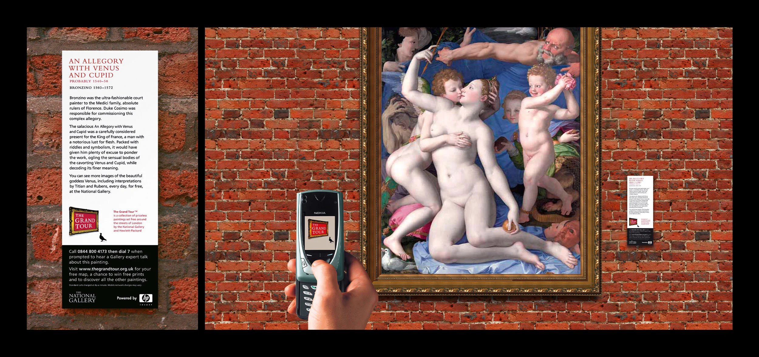
The idea itself was a simple one. Instead of waiting for the public to go to the gallery, we decided to take the gallery to the public. The Grand Tour was born.
The Grand Tour is a Nationwide exhibition of National Gallery paintings, outside on the streets of Britain – amongst shops, pubs and traffic. In the thick of real people’s lives.
This is only made possible by creating a brand identity distinct from the National Gallery, that allows it to behave in a more challenging and contemporary way to find a new, non-traditional audience.
Print collateral
A support campaign was created, including printed maps, posters and advertising. The tour appeared in listings magazines under ‘free exhibitions’.
A Fresh Tone of Voice
We created a new way of talking about the paintings, to reflect the street surroundings, but that doesn’t compromise the eloquence of the Gallery brand.
Special curator commentaries are recorded for each painting and accessible by phone. The curators talk in a frank way about the paintings, in a way that perhaps wouldn’t be appropriate inside the Gallery.
Online
The Grand Tour has it’s own website, thegrandtour.org.uk, distinct from the Gallery site, where you can download bespoke tours.
Themed tours were created that split The Grand Tour into manageable chunks, each with a map and audio commentary.
In a first for the Gallery, photosharing was encouraged on Flickr, with amateur snappers trying to complete the whole set.
Outcome
An increase in the number of visits to The National Gallery itself during the campaign.
As a bonus, The National Gallery Grand Tour was awarded a Black Pencil / Gold, Silver and multiple In-Books at the D&AD awards, as well as awards from The Design Week Awards, New York Festivals, Art Directors Club, M&M, Campaign Big Awards, Cannes Design Lions, Guardian Media Mega Awards and many more.
“Paul is affable, able to take on challenges and ambitious. And that's just the letter 'a'. During his time at The Partners he was a key member of the team delivering creativity on projects big and small, able to paint with broad brushstrokes and craft with detail. Beyond the quality of his ideas, he's a great fella to work with and would be a great asset to any team.”
— Robert Ball, Creative Director at The Partners
Spiegel & Grau brand identity
Project background
Create an identity for a new publishing brand at Random House, set up by two of New York’s hottest editors.
The idea
Make a virtue out of the unusual names, creating an arrangement that literally fitted with their world.
Doubleday brand identity
Project background
Create a brand identity with gravitas for one of New York’s most iconic publishers.
The idea
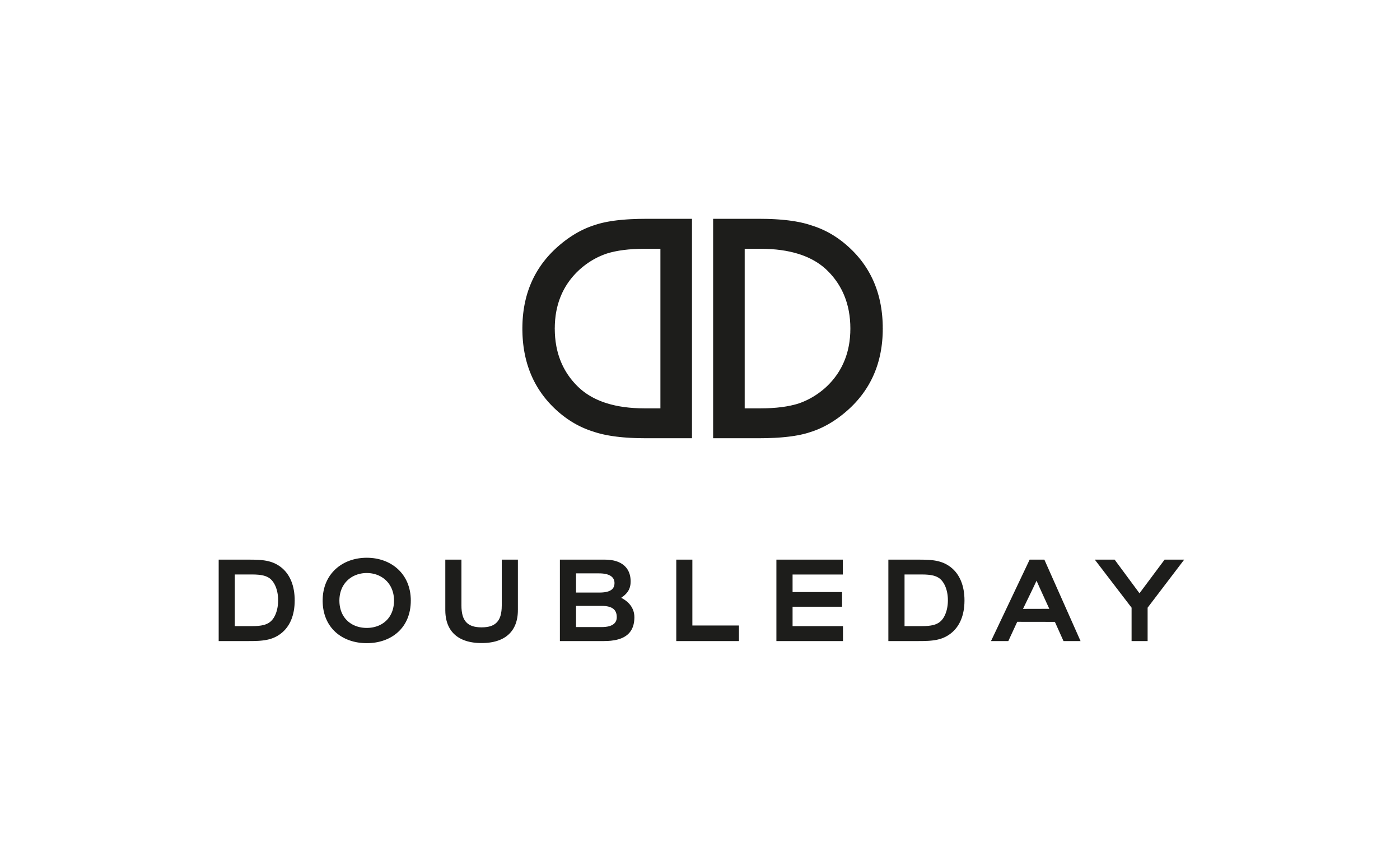
The catwalk meets bookshelf – the double D acronym is used heroically like a high fashion brand.
Winnersh Triangle launch campaign
Project background
Despite being in a prime location on the M4 corridor, the Winnersh Triangle business park was unloved, dated and saddled with empty office space. As a multi-million pound redevelopment program began, The Partners were brought in to create a fresh and exciting Winnersh Triangle brand.
The idea
The park hopes to attract big thinkers, and this was our starting point. We created the brand idea ‘Opportunity in Everything’ and began reinventing all levels of communication.
Print, web, advertising and environmental applications were all overhauled. On a larger scale, several international artists transformed the park by creating dramatic works of art, all from everyday objects.
The new brand forced potential clients to reconsider Winnersh Triangle, and position it at the forefront of ambitious business thinking.
Print collateral
Launch brochure and lenticular promotional mailer.
Launch event
At the launch night each of the 300 guests were given a small image of the park.
Upon arrival, they each placed their invitation on a huge grid which revealed the whole of the redeveloped park. It illustrated how their small piece had contributed to the bigger picture: a completely transformed brand.
Deloitte PlanetSaver logo
Project background
The brief was to create a corporate screensaver for Deloitte's 160,000 staff. However, since the death of CRT monitors, screens don't need saving. With 160,000 people you can save something much bigger…
The idea
Instead of wasting energy with a screensaver when you're not using your computer, PlanetSaver will put it to sleep. The average Deloitte laptop consumes 0.35 kWh. The average computer is in PlanetSaver mode for 14 hours. Multiplied by 160,000 users, this equates to a potential daily energy saving of 390,000 kWh. Enough to keep 1,500 freezers on for a year. PlanetSaver – the largest green initiative of its kind in the world.
Our role
Create a logo that can be reproduced at favicon size, which represents the nature of PlanetSaver. We combined an image of the planet with the globally recognised power icon…
All work above © Copyright The Partners.
“Paul is a bright, clever and talented designer who rightly prioritizes thinking before execution. He is capable of generating a wealth of original and engaging thinking but should not be employed on this strength alone. An efficient designer with great organizational abilities Paul also posseses a much needed eye for detail. Left to his own devices, Paul will consistently deliver briefs on time and (whenever possible) will take the opportunity to propose additional solutions beyond what was originally asked. He is a pleasure to be around and comes equipped with a dry sense of humour that was not wasted during his time at The Partners – where he regularly amused and entertained during his many presentations to staff at the end of a long, hard week.”
— Leon Bahrani, Design Director at The Partners


