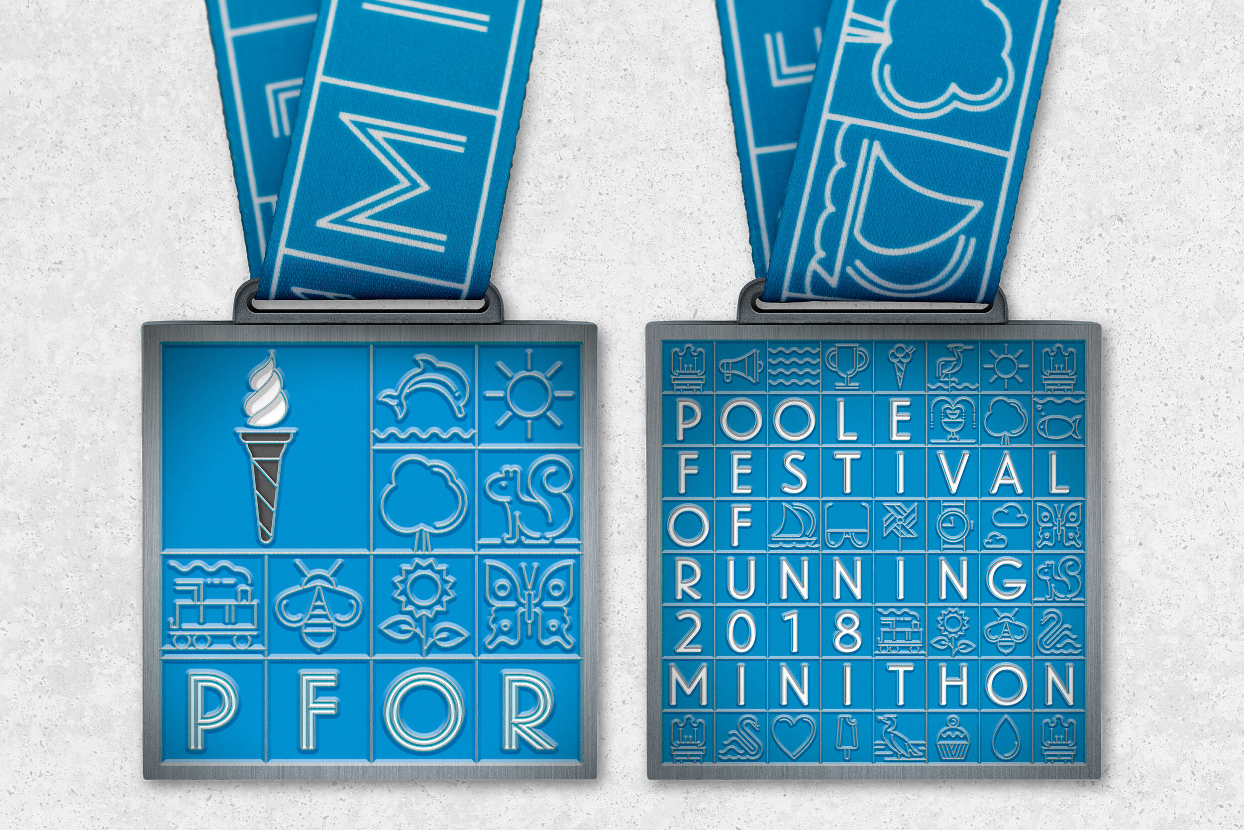
Illustration with Poole Festival of Running
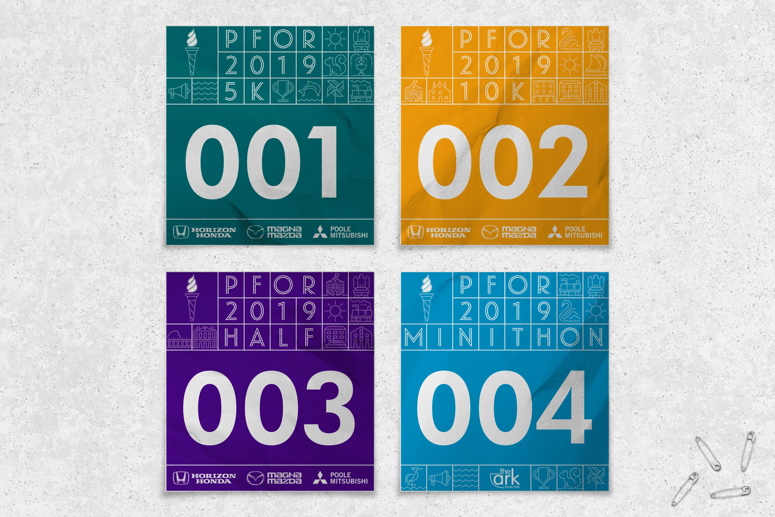
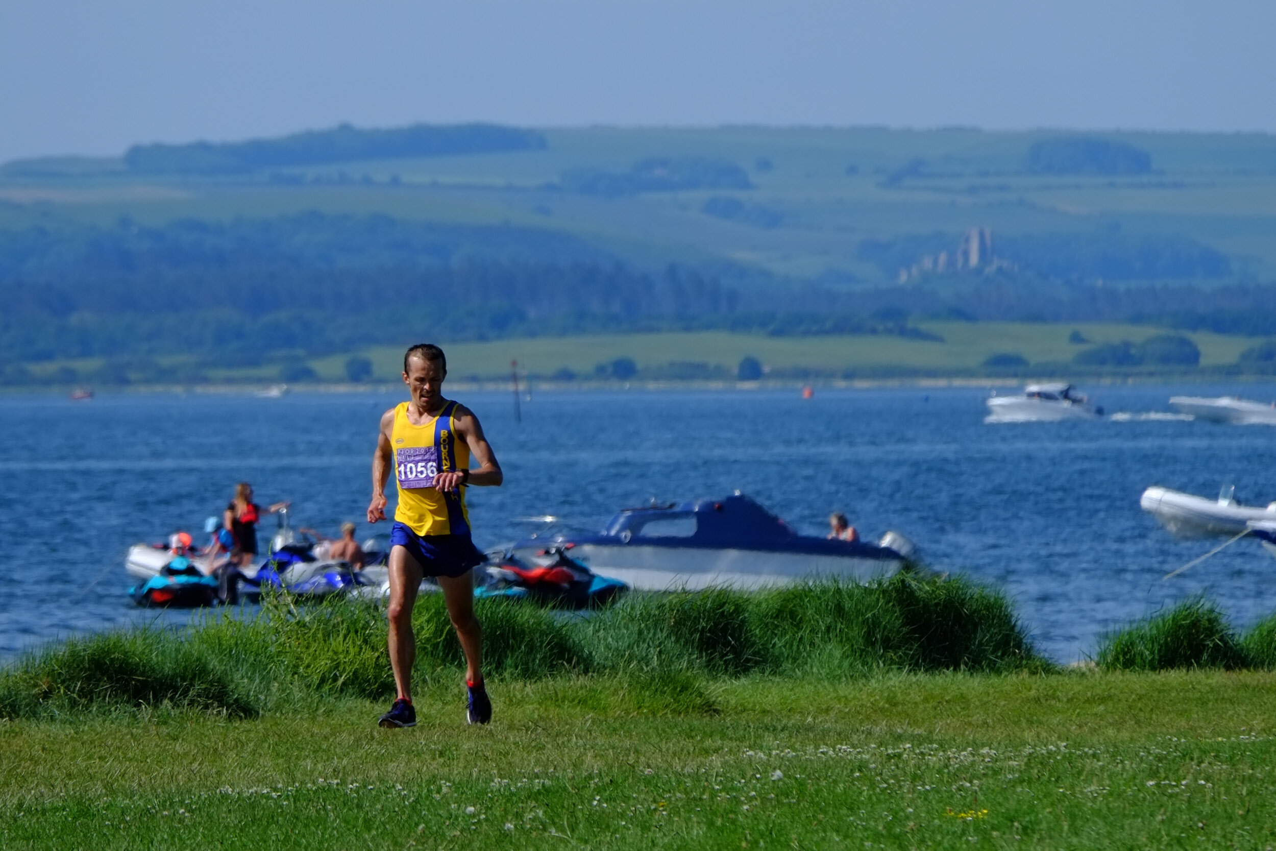
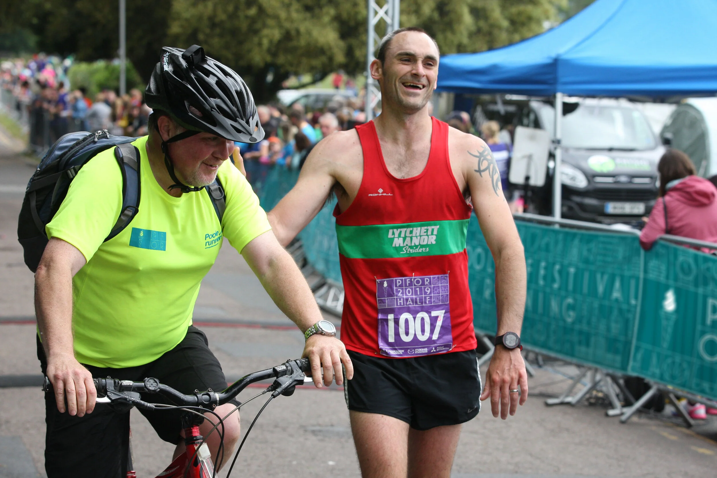
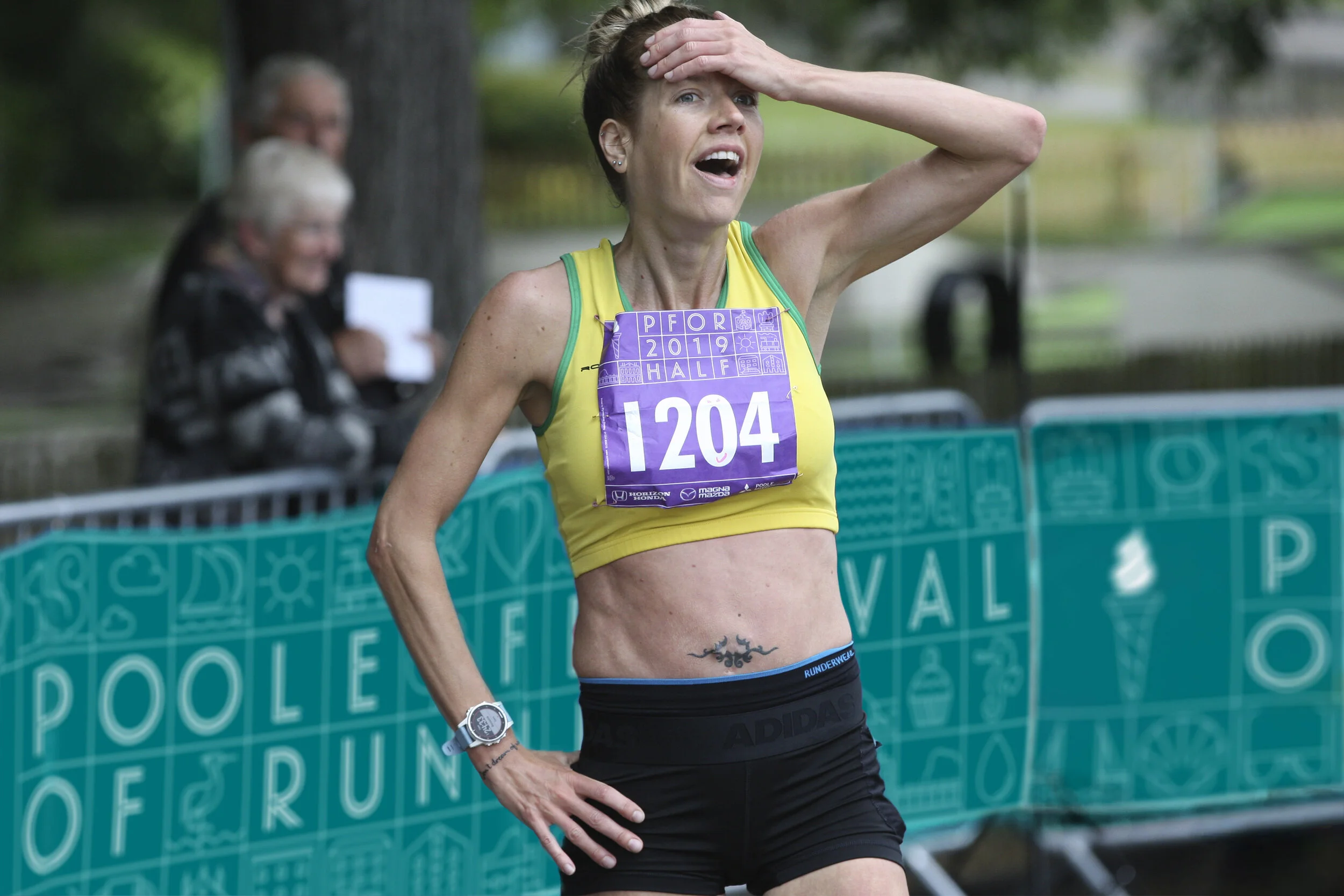
As part of the brand identity Poole Festival of Running, I was commissioned to create a flexible system of illustrations across all touch points for one of the largest running club organised festivals in the UK.
Inspiration
The festival takes place on the shores of Poole harbour – the second largest natural harbour in the world. The harbour, wildlife and landmarks (buildings, bridges etc) provide a rich visual language to draw from. Many of the events also pass through Poole Quay, well known for its history of ceramics; namely Carter tiles.
The idea
We conceived a ceramic tiles inspired visual identity made up of everything Poole Festival of Running has to offer.
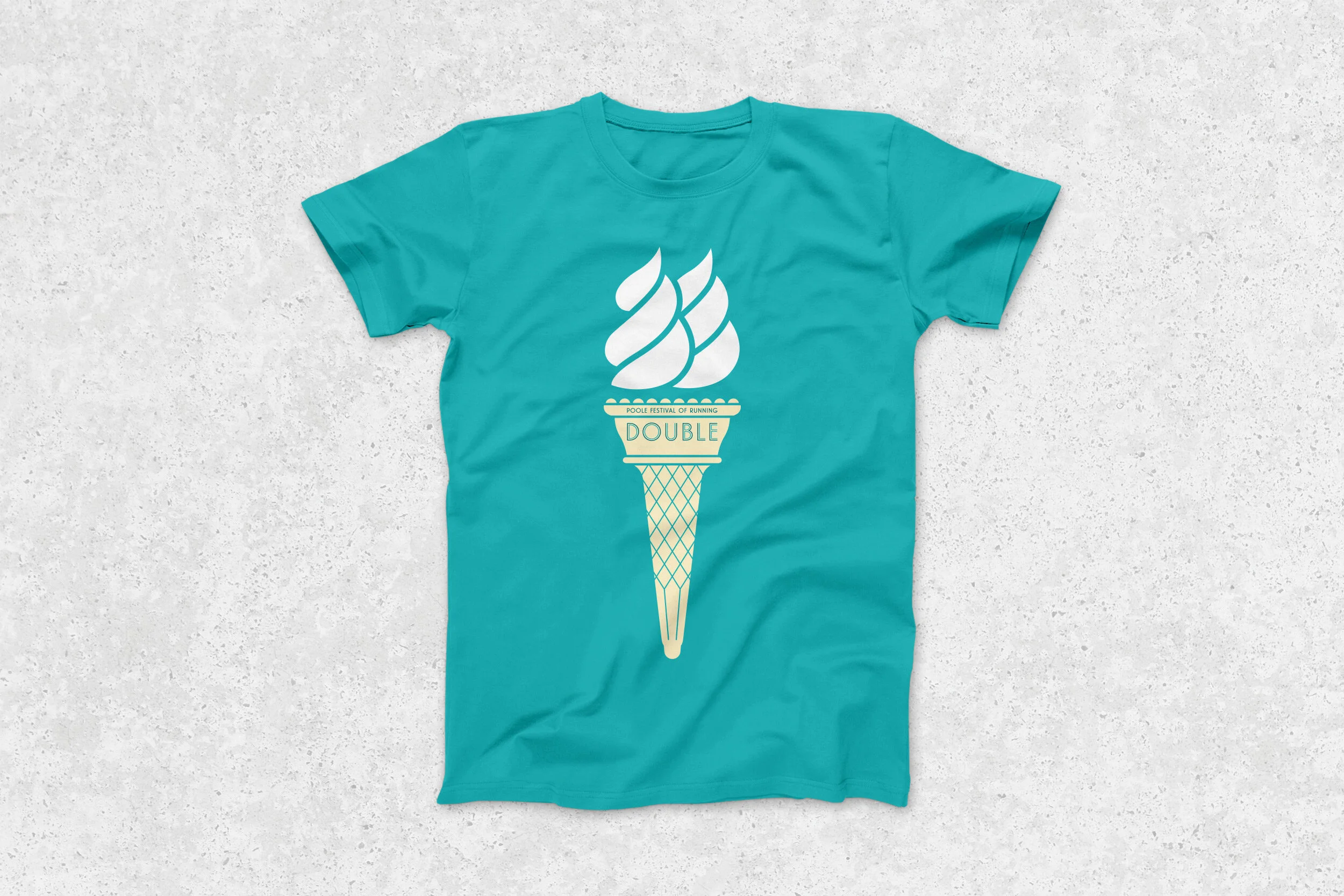
This included crafting an olympic torch / icecream marque that would appeal to both the competitive and fun runner. This marque could then be used as a visual shorthand for the festival across various touchpoints.
We selected a distinctive typeface with an art deco feel, further referencing Poole’s ceramics heyday…
It all began in a sketchbook…
“We have had the pleasure of working with Paul for a number of years - always great creativity accompanied with top class service. Looking forward to working with you again soon!”
— Poole Festival Of Running / Poole Runners Committee


