Brand identity with Poole Festival of Running
We were commissioned to explore brand identity concepts for Poole Festival of Running – one of the largest running club organised festivals in the UK, with all profits going to charity.
Project scope
Research
Brand identity concepts and development
Logo / logotype and brand mark / icon
Iconography / illustrations
Typography
Colour palette
Posters
Small printed / digital maps
Large format maps
Polaroid photo frame prop
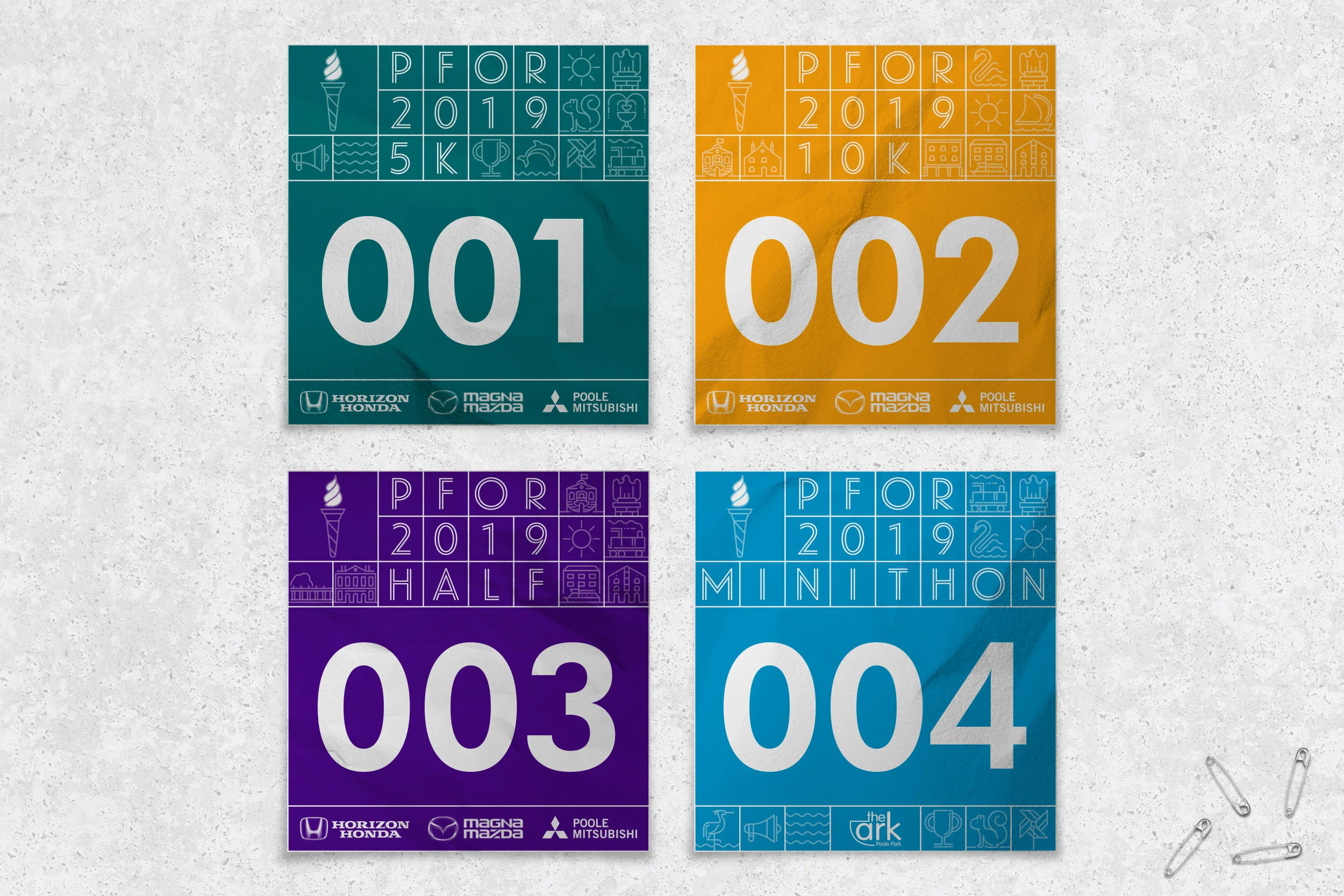
Race numbers
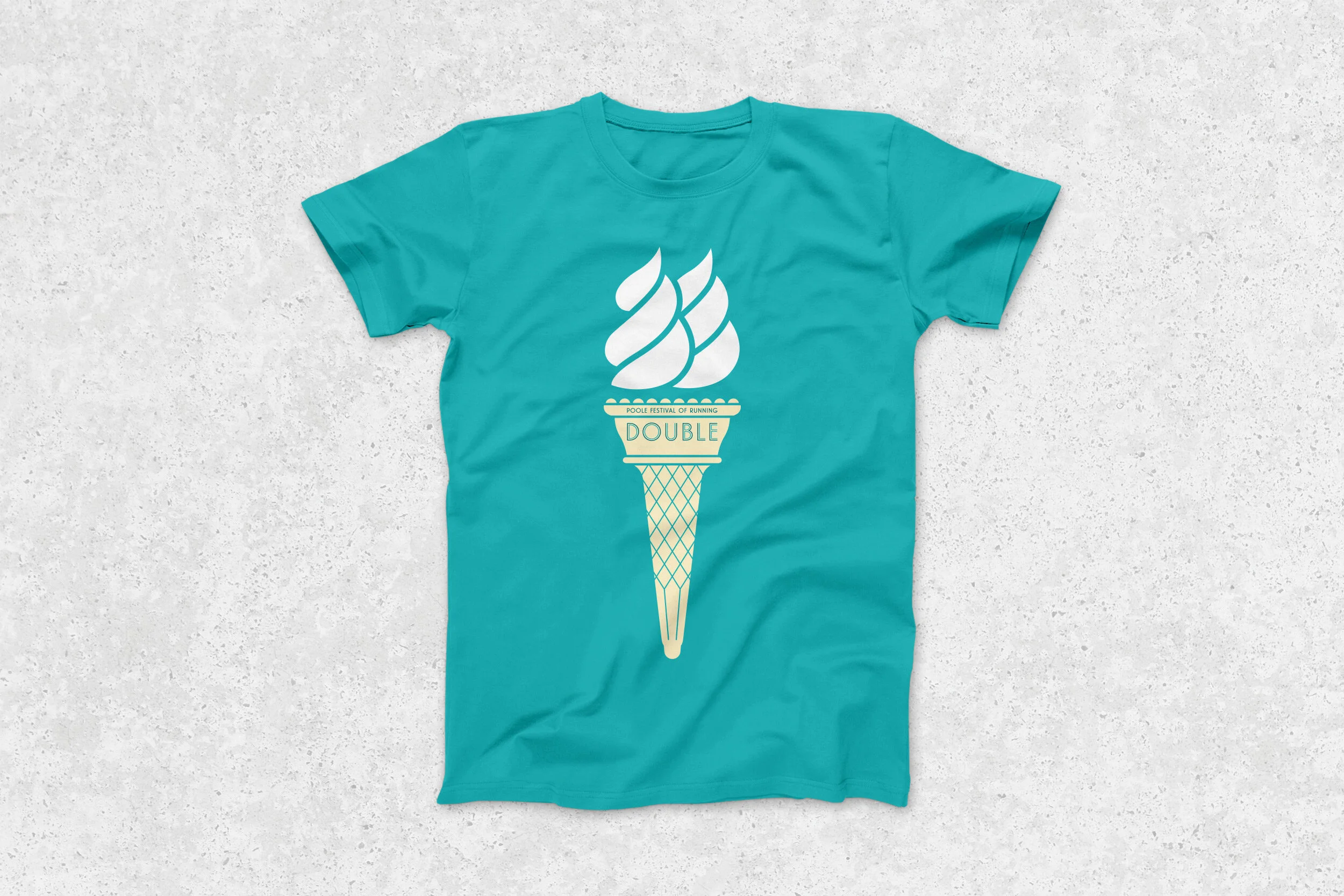
Finishers’ t-shirts
Barrier tape
Start / Finish area large format print
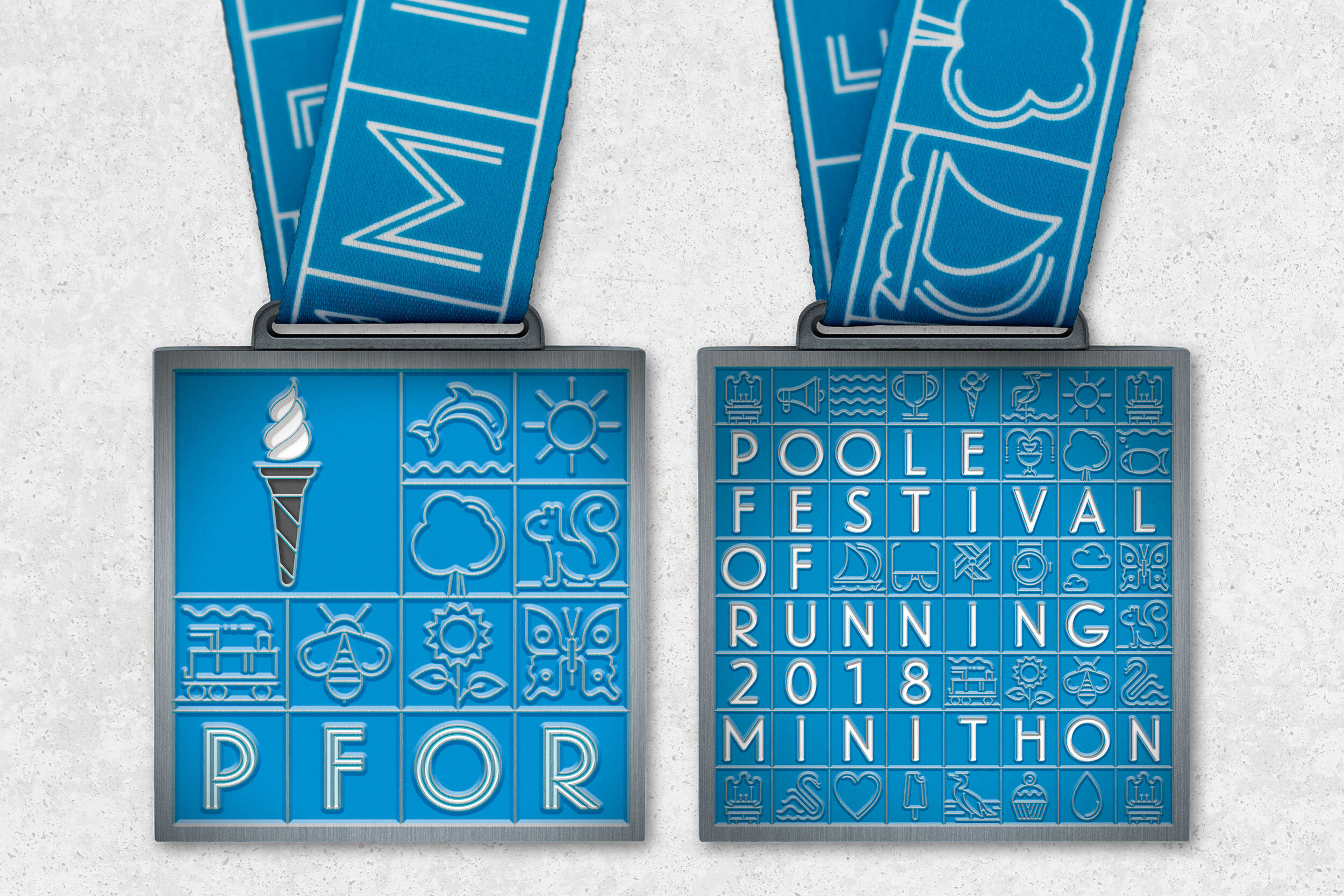
5K, 10K, Half Marathon and Minithon medals / medallions and ribbons
Trophies
Signage / wayfinding infographics
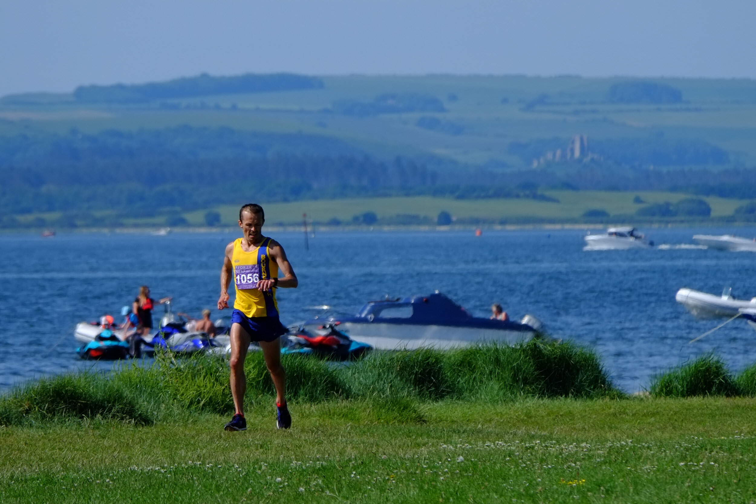
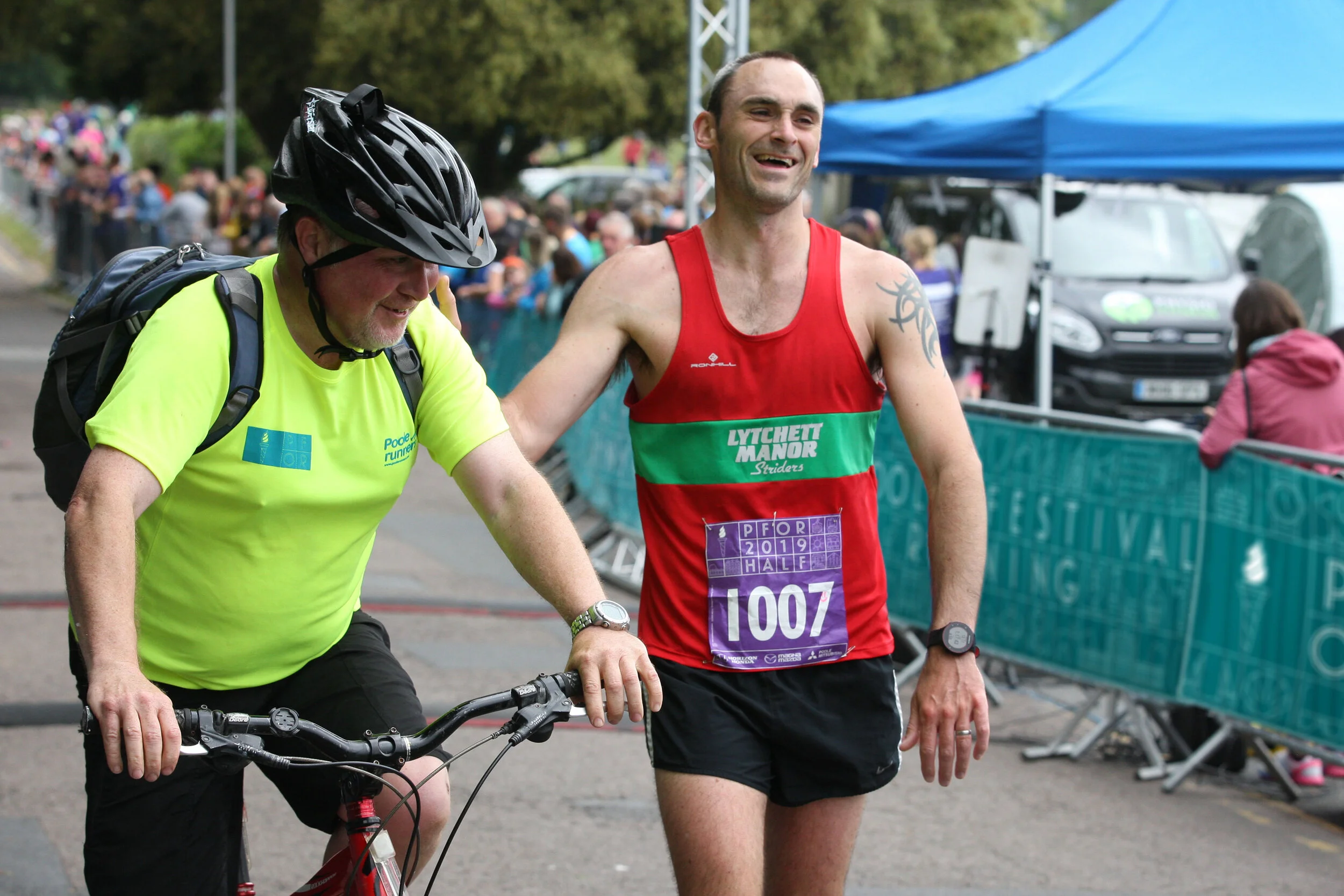
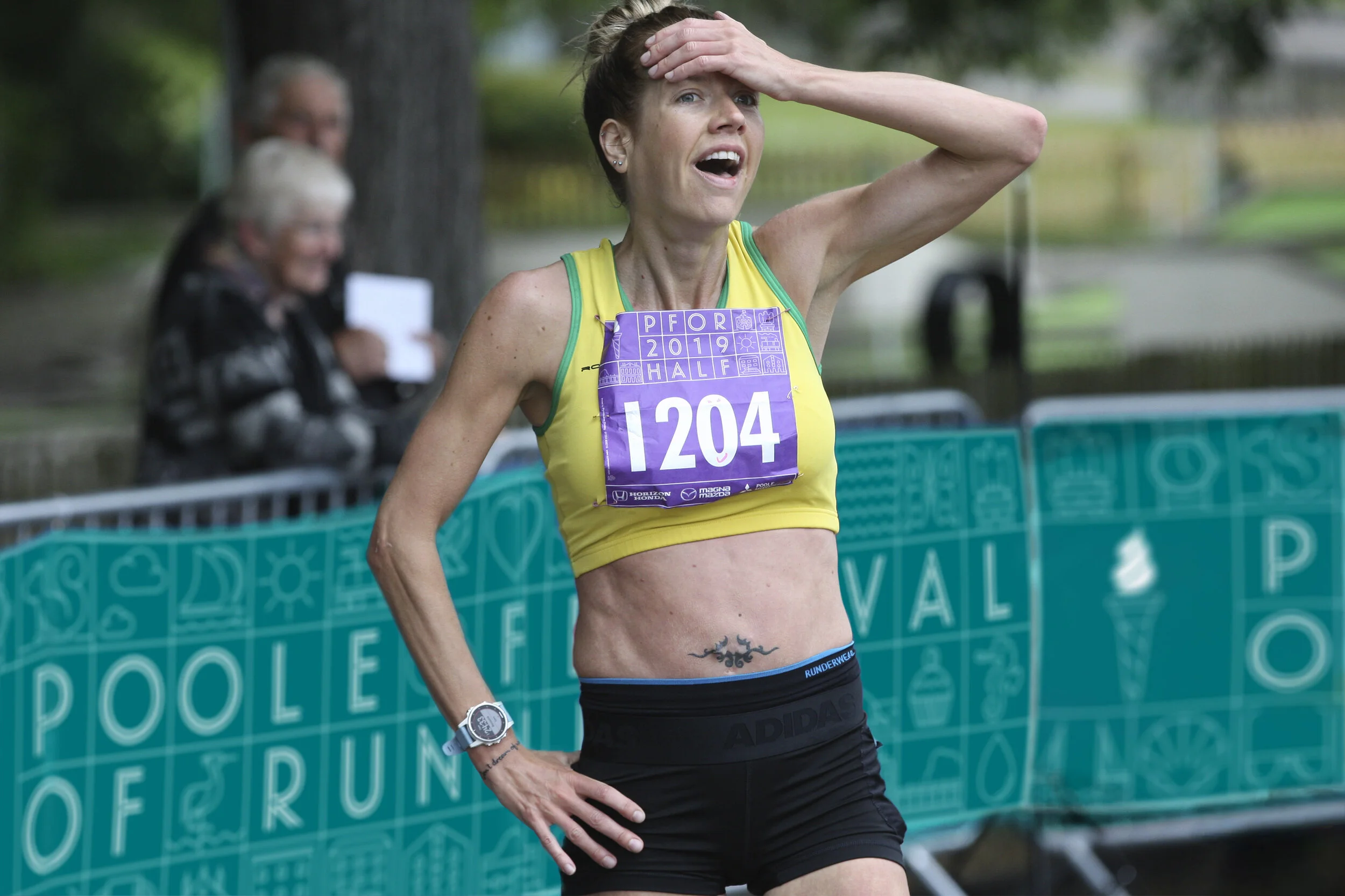
Photography
Document social media
All collateral required
Inspiration
The festival takes place on the shores of Poole harbour – the second largest natural harbour in the world. The harbour, wildlife and landmarks (buildings, bridges etc) provide a rich visual language to draw from. Many of the events also pass through Poole Quay, well known for its history of ceramics; namely Carter tiles.

The idea
We conceived a ceramic tiles inspired visual identity made up of everything Poole Festival of Running has to offer.
This included crafting an olympic torch / icecream marque that would appeal to both the competitive and fun runner. This marque could then be used as a visual shorthand for the festival across various touchpoints.
We selected a distinctive typeface with an art deco feel, further referencing Poole’s ceramics heyday…


It all began in a sketchbook…


“We have had the pleasure of working with Paul for a number of years - always great creativity accompanied with top class service. Looking forward to working with you again soon!”
— From all at Poole Festival Of Running & Poole Runners
Credits
Selected race photography
by Richard Crease Photography
Medals production
by Fast Track Medals & Awards
Large format polaroid production
by Goodwin graphics
Typography
Landmark and Verlag by Hoefler & Co