Brand identity and website with National Association for Hospice at Home
We were commissioned to overhaul the brand identity and website of National Association for Hospice at home, a charitable membership body for organisations working in hospice at home services across the UK.
Project scope
Research
Brand identity concepts and development
Brand toolkit
Logotype
Colour palette
Typography
Imagery
Iconography
Website planning, design, prototyping, build and launch at annual conference.
Existing brand assets
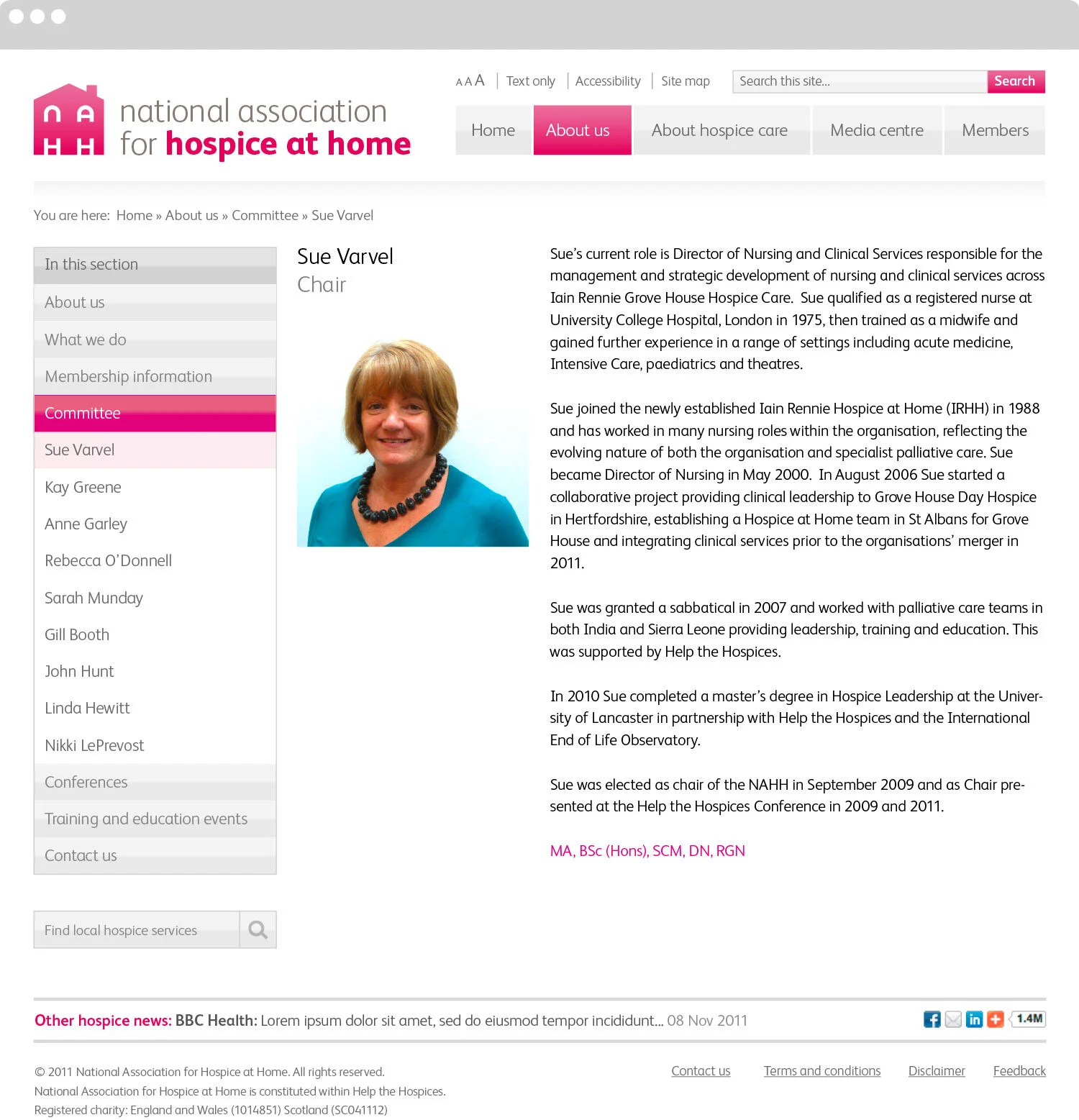
National Association for Hospice at Home approached us with a broken website and inconsistent brand.
The first challenge was how to approach the name, which couldn’t be changed and was widely referred to in the sector by its acronym “NAHH”.
Following much research and consultation with the committee, they instructed us to proceed with the brand identity concepts based on this acronym.
Old website (not our design)

Logo
We literally turned the acronym into a positive. We arranged the letterforms into the graphic image of a home, with the universal symbol of healthcare in the negative space.
Small brand icon
We crafted a brand icon to work at small sizes. This could be used as a favicon online, and as a lapel pin to proudly show membership of the organisation.

Typography
We researched and selected a contemporary and friendly sans serif font FS Albert, which we used in the logotype and consistently across all brand touchpoints.

Colour palette
We developed a minimal, warm and ownable colour palette to ensure all brand touchpoints were consistent across digital and print.
One key brand asset that was developed was the pink gradient, taken directly from the logotype. When applied to other iconography, each design felt distinctly on brand.

Iconography
We designed a library of icons that could be across the new website, ensuring clear communication, calls to action and brand consistency.
Imagery style
We sourced well lit, reportage style photography for key pages of the website – helping with the hierarchy of information, and lightening the feel.

Website
Working closely with the committee, we researched, planned, prototyped and delivered a completely redesigned website. We guided the committee throughout the process, collaborating on various new feature requests, including a new members area – ensuring all of their requirements were met.


Website launch
Following the website’s build, testing and sign-off by the committee, we launched the website at the National Association for Hospice at Home’s annual conference, in front of hundreds of attendees.
“Paul Currah created a totally new identity for us which has transformed our image as an association. Additionally, we required our website to be redeveloped and overhauled. The service was excellent – a range of high quality and innovative ideas were produced and presented in a user-friendly format with comprehensive descriptions and explanations. Our target audience and user base is complex, but Paul quickly developed ideas which would help us better communicate our core business. All required amends were managed either on or ahead of time, making it easy for us to manage the process, and Paul was accessible for email or telephone discussion. Another important aspect for us was the standard of independent advice – a key element when dealing with other IT professionals. An excellent service.”
– Sue Varvel, President of National Association for Hospice at Home